string(14779) "/**
* Correct `block` display not defined in IE 8/9.
*/
article,
aside,
details,
figcaption,
figure,
footer,
header,
hgroup,
main,
nav,
section,
summary {
display: block;
}
/**
* Correct `inline-block` display not defined in IE 8/9.
*/
audio,
canvas,
video {
display: inline-block;
}
/**
* Prevent modern browsers from displaying `audio` without controls.
* Remove excess height in iOS 5 devices.
*/
audio:not([controls]) {
display: none;
height: 0;
}
/* ==========================================================================
Base
========================================================================== */
/**
* 1. Set default font family to sans-serif.
* 2. Prevent iOS text size adjust after orientation change, without disabling
* user zoom.
*/
html {
font-family: sans-serif; /* 1 */
-ms-text-size-adjust: 100%; /* 2 */
-webkit-text-size-adjust: 100%; /* 2 */
}
/**
* Remove default margin.
*/
body {
margin: 0;
}
/* ==========================================================================
Links
========================================================================== */
/**
* Remove the gray background color from active links in IE 10.
*/
a {
background: transparent;
}
/**
* Address `outline` inconsistency between Chrome and other browsers.
*/
a:focus {
outline: thin dotted;
}
/**
* Improve readability when focused and also mouse hovered in all browsers.
*/
a:active,
a:hover {
outline: 0;
}
/* ==========================================================================
Typography
========================================================================== */
/**
* Address differences between Firefox and other browsers.
*/
hr {
-moz-box-sizing: content-box;
box-sizing: content-box;
height: 0;
}
/**
* Prevent `sub` and `sup` affecting `line-height` in all browsers.
*/
sub,
sup {
font-size: 75%;
line-height: 0;
position: relative;
vertical-align: baseline;
}
sup {
top: -0.5em;
}
sub {
bottom: -0.25em;
}
/* ==========================================================================
Forms
========================================================================== */
/**
* 1. Correct font family not being inherited in all browsers.
* 2. Correct font size not being inherited in all browsers.
* 3. Address margins set differently in Firefox 4+, Safari 5, and Chrome.
*/
button,
input,
select,
textarea {
font-family: inherit; /* 1 */
font-size: 100%; /* 2 */
margin: 0; /* 3 */
}
/**
* Address Firefox 4+ setting `line-height` on `input` using `!important` in
* the UA stylesheet.
*/
button,
input {
line-height: normal;
}
/**
* Address inconsistent `text-transform` inheritance for `button` and `select`.
* All other form control elements do not inherit `text-transform` values.
* Correct `button` style inheritance in Chrome, Safari 5+, and IE 8+.
* Correct `select` style inheritance in Firefox 4+ and Opera.
*/
button,
select {
text-transform: none;
}
/**
* 1. Avoid the WebKit bug in Android 4.0.* where (2) destroys native `audio`
* and `video` controls.
* 2. Correct inability to style clickable `input` types in iOS.
* 3. Improve usability and consistency of cursor style between image-type
* `input` and others.
*/
button,
html input[type="button"], /* 1 */
input[type="reset"],
input[type="submit"] {
-webkit-appearance: button; /* 2 */
cursor: pointer; /* 3 */
}
/**
* Re-set default cursor for disabled elements.
*/
button[disabled],
html input[disabled] {
cursor: default;
}
/**
* Remove inner padding and border in Firefox 4+.
*/
button::-moz-focus-inner,
input::-moz-focus-inner {
border: 0;
padding: 0;
}
/**
* 1. Remove default vertical scrollbar in IE 8/9.
* 2. Improve readability and alignment in all browsers.
*/
textarea {
overflow: auto; /* 1 */
vertical-align: top; /* 2 */
}
/* ==========================================================================
Tables
========================================================================== */
/**
* Remove most spacing between table cells.
*/
table {
border-collapse: collapse;
border-spacing: 0;
}
*, *:after, *:before {
-webkit-box-sizing: border-box;
-moz-box-sizing: border-box;
box-sizing: border-box;
}
.blitz-has-parallax {
position: relative;
overflow: hidden;
}
.blitz-parallax {
position: absolute;
left: 0;
top: 0;
bottom: 0;
right: 0;
background-size: 100%;
transform: translateZ(-1px) scale(1.5);
z-index: -1;
background-attachment: fixed;
}
.post-list .default .thumbnail {
padding-right: 15px;
}
.post-list .default .preview {
display: inline-block;
vertical-align: top;
}
.post-list article.default {
padding-bottom: 20px;
border-bottom: 1px solid #8080803d;
margin-bottom: 20px;
display: inline-block;
}
#content p,
#content h1,
#content h2,
#content h3,
#content h4,
#content h5,
#content h6 {
margin-top: 0;
}
button {
font-size: 100%;
line-height: normal;
}
header nav li .sub-menu {
position: absolute;
background: white;
box-shadow: 1px 2px 3px rgba(0, 0, 0, 0.6);
border-top: 2px solid rgb(68, 68, 68);
display: none;
padding: 0;
min-width: 200px;
z-index: 9;
}
header .menu-item-has-children > a:after {
content: '\f0d7';
position: absolute;
font-family: 'Font Awesome 5 Free';
margin-left: 5px;
margin-top: 4px;
font-size: 13px;
font-weight: 600;
}
header nav li:hover > .sub-menu {
display: block;
}
header nav li {
position: relative;
list-style-type: none;
display: inline-block;
}
header nav li a,
header nav li span.no-link {
width: 100%;
padding: 15px 20px;
display: inline-block;
transition: all .2s ease-in-out;
}
a {
color: #444;
text-decoration: none;
}
.wrapper {
margin: 25px auto;
width: 100%;
}
.wrapper > * {
white-space: initial;
}
/*Module Formatting Styles*/
body:not(.amp) .iframe:not(.ratio-none) {
position: relative;
overflow: hidden;
}
body:not(.amp) .iframe.ratio-16-9 {
padding-top: 56.25%;
}
body:not(.amp) .iframe.ratio-4-3 {
padding-top: 75%;
}
body:not(.amp) .iframe:not(.ratio-none) iframe {
position: absolute;
top: 0;
left: 0;
width: 100%;
height: 100%;
border: 0;
}
.accordion-tab header {
background-color: #eee;
border: none;
padding: 18px;
outline: none;
transition: 0.4s;
font-size: 1.2em;
}
.accordion.no-styling header, .accordion.read-more header {
background-color: initial;
padding: 0;
font-size: inherit;
}
.accordion header {
cursor: pointer;
}
.accordion [expanded] > header,
.accordion header:hover {
background-color: #ccc;
}
.accordion.no-styling [expanded] > header, .accordion.read-more [expanded] > header,
.accordion.no-styling header:hover, .accordion.read-more header:hover {
background-color: initial;
}
.accordion .panel {
display: none;
overflow: hidden;
}
.accordion.read-more header {
font-weight: bold;
}
.accordion.read-more .panel,
.accordion.no-styling .panel {
padding-top: 1em;
}
.accordion-tab .panel {
padding: 16px 18px 0;
background-color: white;
}
.accordion.read-more .panel,
.accordion.no-styling .panel {
padding-top: 1em;
}
.accordion.no-styling .panel {
background-color: initial;
}
.accordion.read-more .panel {
background-color: #eee;
margin-top: 1em;
}
.accordion [expanded] > .panel {
display: block;
}
.icon.wrapper .icon-wrap {
display: inline-block;
width: 1em;
height: 1em;
border-style: solid;
box-sizing: border-box;
position: relative;
}
.icon.wrapper .icon-wrap .icon-inner {
position: absolute;
left: 50%;
top: 50%;
transform: translate(-50%, -50%);
font-size: 75%;
}
.icon.wrapper .icon-innards {
position: relative;
display: inline-block;
}
.icon.wrapper .icon-innards > a {
position: absolute;
left: 0;
top: 0;
width: 100%;
height: 100%;
z-index: 1;
}
.icon.wrapper .caption {
text-align: left;
}
.icon.wrapper .caption a,
.icon.wrapper a.button {
position: relative;
z-index: 2;
}
.icon.wrapper.place-Top .caption {
margin-top: 1em;
}
.icon.wrapper.place-Left .icon-innards,
.icon.wrapper.place-Right .icon-innards {
display: inline-flex;
}
.icon.wrapper.place-Left .icon-bottom {
padding-left: 1.5em;
}
.icon.wrapper.place-Right .icon-bottom {
padding-right: 1.5em;
}
.icon.wrapper.vert-Middle .icon-innards {
align-items: center;
}
.icon.wrapper.vert-Bottom .icon-innards {
align-items: flex-end;
}
.icon.wrapper .button.wrapper {
margin-bottom: 0;
}
.icon.wrapper .caption > *:last-child {
margin-bottom: 0;
}
.icon.wrapper .custom-icon div {
width: 1em;
height: 1em;
background-position: center;
background-size: contain;
background-repeat: no-repeat;
position: absolute;
left: 50%;
top: 50%;
transform: translate(-50%, -50%);
}
.icon.wrapper .custom-icon div:nth-of-type(2) {
opacity: 0;
}
.blitz-mobile-menu [expanded] > header,
.blitz-mobile-menu header:hover {
background-color: #eee;
}
.blitz-mobile-menu .sub-menu > header {
background: #ccc;
}
.blitz-mobile-menu .toggle {
float: right;
}
.orient-center {
text-align: center;
}
.orient-left {
text-align: left;
}
.orient-right {
text-align: right;
}
.orient-justified {
text-align: justify;
}
.text-light {
color: #ffffff;
}
.menu-toggle button {
background: transparent;
border: none;
}
.section.background-img {
background-size: cover;
}
.section-overlay {
position: absolute;
left: 0;
top: 0;
width: 100%;
height: 100%;
z-index: 2;
}
.section.has-overlay {
position: relative;
}
.section.has-overlay > *:not(.section-overlay):not(.blitz-parallax),
.section.has-overlay:before,
.section.has-overlay:after {
z-index: 3;
position: relative;
}
/*End Module Formatting Styles*/
/*Template Constraints*/
.section {
width: 100%;
padding: 25px 0;
text-align: center;
white-space: nowrap;
}
header .section {
padding: 0;
}
header .constraint {
align-items: center;
}
.constraint {
width: 80%;
display: flex;
margin: 0 auto;
flex-wrap: wrap;
justify-content: flex-start;
}
.section.fullwidth .constraint {
width: 100%;
max-width: initial;
}
.column {
box-sizing: border-box;
padding: 0 10px;
display: inline-block;
vertical-align: top;
white-space: normal;
text-align:left;
}
.width-12 {
width: 100%;
display: block;
}
.width-9 {
width: 75%;
}
.width-8 {
width: 66.66%;
}
.width-6 {
width: 50%;
}
.width-4 {
width: 33.33%;
}
.width-3 {
width: 25%;
}
/*End Template Constraints*/
/* Admin Bar AMP */
.admin-bar-amp {
background: #23282d;
padding-left: 15px;
padding-right: 15px;
color: #eee;
line-height: 0;
}
.admin-bar-amp p {
margin: 0;
font-size: 13px;
}
.admin-bar-amp .useful-links {
line-height: 0;
}
.admin-bar-amp .user-info a {
margin-left: 10px;
}
.admin-bar-amp .user-info {
text-align: right;
}
.admin-bar-amp a i {
margin-right: 6px;
}
.admin-bar-amp a {
color: #eee;
display: inline-block;
line-height: 32px;
padding: 0 8px 0 7px;
font-size: 13px;
}
.admin-bar-amp a:hover {
background-color: #32373c;
color: #00b9eb;
}
.admin-bar-amp > div {
width: 50%;
display: inline-block;
vertical-align: middle;
}
/* End Admin Bar AMP */
img {
max-width: 100%;
height: auto;
}
.uses-fixed-header.admin-bar > header {
margin-top: 32px;
}
.halign-left {
justify-content: left;
}
.halign-mid,
.halign-center,
.halign-middle {
justify-content: center;
}
.halign-right {
justify-content: right;
}
.halign-self-left {
justify-self: left;
}
.halign-self-mid,
.halign-self-center,
.halign-self-middle {
justify-self: center;
}
.halign-self-right {
justify-self: right;
}
.valign-top {
align-items: flex-start;
}
.valign-mid,
.valign-middle {
align-items: center;
}
.valign-bottom {
align-items: flex-end;
}
.valign-self-top {
align-self: flex-start;
}
.valign-self-mid,
.valign-self-middle {
align-self: center;
}
.valign-self-bottom {
align-self: flex-end;
}
/*Media Queries*/
@media all and ( min-width: 1025px ) {
.admin-bar.uses-fixed-header .content-wrapper,
.ui-page.uses-fixed-header > header {
margin-top: 32px;
}
.blitz-mobileT {
display: none;
}
}
@media all and ( min-width: 768px ) {
.blitz-mobile {
display: none;
}
}
@media all and (max-width: 1024px) {
.section {
padding: 12.5px 0;
}
.wrapper {
margin: 12.5px 0;
}
.blitz-desktop {
display: none;
}
}
@media all and ( max-width: 767px ) {
.column:not(.no-resize):not(.blitz-desktop):not(.blitz-desktopT),
.width-12:not(.no-resize):not(.blitz-desktop):not(.blitz-desktopT),
.width-9:not(.no-resize):not(.blitz-desktop):not(.blitz-desktopT),
.width-8:not(.no-resize):not(.blitz-desktop):not(.blitz-desktopT),
.width-6:not(.no-resize):not(.blitz-desktop):not(.blitz-desktopT),
.width-4:not(.no-resize):not(.blitz-desktop):not(.blitz-desktopT),
.width-3:not(.no-resize):not(.blitz-desktop):not(.blitz-desktopT) {
width: 100%;
display: block;
}
.blitz-desktopT {
display: none;
}
.constraint {
width: 90%;
}
}
.constraint {
max-width: 1516px;
}
@media all and (min-width: 1025px) {
body > header, .ui-page > header {
position: fixed;
top: 0;
width: 100%;
z-index: 9;
}
}
.wrapper[data-index="36"] { margin-bottom: 5px; } #mobile-header .header-cta {
text-align: center;
}
#mobile-header .header-cta a {
color: #474747;
margin-left: 5px;
}
.header-cta {
margin: 0;
}
@media all and (max-width:480px){
.header-cta span{
display:none;
}
.header-cta a:before{
content:;
}
} .wrapper[data-index="21"] { margin-top: 0; } .wrapper[data-index="21"] { margin-bottom: 0; } .column[data-index="0"] { padding-left: 5px; } .column[data-index="0"] { padding-right: 5px; }
.menu-toggle button {
padding: 0;
outline: none;
}
.mobile-menu header.no-toggle {
padding: 0;
}
.mobile-menu.accordion .panel {
padding: 0;
}
.mobile-menu .menu {
position: absolute;
width: 100%;
z-index: 9;
left: 0;
}
.mobile-menu header {
width: auto;
}
.mobile-menu .accordion {
position: relative;
}
.section[data-index="8"] { padding-top: 0; } .section[data-index="8"] { padding-bottom: 0; } .wrapper[data-index="42"] { margin-top: 0; } .wrapper[data-index="42"] { margin-bottom: 0; } .column[data-index="17"] { padding-left: 0; } .column[data-index="17"] { padding-right: 0; } .section[data-index="9"] { padding-bottom: 0px; } .column[data-index="21"] { padding-left: 0; } .column[data-index="21"] { padding-right: 0; }"
We are an agency of ACTION
We believe in the power of marketing to move and engage audiences. We create conversation-starting work for our clients with campaigns that boost leads, build brand reputation, and drive real business results - or even inspire change.
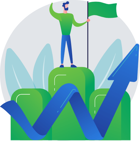
With positive action and bold leadership we'll keep working hard to get the job done. By strategically and holistically determining the best path to your success, we work with you to find a meaningful solution to all things marketing.
All of our relationships are genuine, with honesty, integrity and transparency as the building block for everything we do. Our analysis of your needs and project take into consideration your budget, timeline and scope of the work to be done. We use logic and creativity to help take your business to the next level. Let us creatively solve your next business issue. We'll walk you though:
Discovery
Research/Analysis
Target Audience Definition
Strategic Planning
Technical Consulting
Creative Design
Action Plan Development
Formalization of Tactics
Defining Project Specifications
Review, Evaluation and Reporting
Don't start another project without tapping our brains about it. If you've been imaging it for awhile, let us help you get 'er done!
Request Your Free Online Audit and Consultation Today
Call NowWoman-Owned Business
Digital Division is proudly women-owned and operated.
Let’s Build Some Momentum Together
We have the chops to move your marketing to the next level. Put some fuel behind your next project and let us help you steer your results to success.
206 SE 2nd St
Lee's Summit, Missouri 64063