

Brand Pampering with Anti-Aging Design & SEO
New Health Kansas is a holistic wellness clinic that provides medical weight loss, skincare, regenerative treatments and medspa facility with locations in Topeka, Manhattan, and Lenexa, Kansas. This comprehensive service provider needed a full marketing strategy to lift the brand and improve customers' access to services.
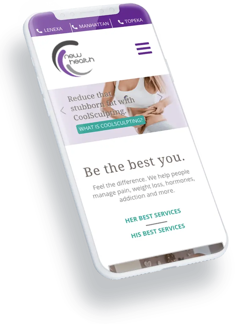
Mobile-First Web Site
Digital Division designed and built a new, mobile-first website for New Health Kansas and incorporated SEO, paid search, and social media services for improved search results, website traffic, brand awareness, and lead generation as well as conversions. New Health Kansas wanted to focus marketing efforts on promoting currents services and specials as well as generating leads in their service areas.
A Mobile-First website was designed using fresh branding concepts and a holistic approach to existing messaging and online presence. The website was developed in WordPress CMS for ease of use and enhanced functionality. Blog functionality was adapted for easier access and categorization within the CMS.
New Website, New You
A stunning, mobile-first website is only the beginning of what we can offer. Learn from us how to make a new website the cornerstone of your marketing success.
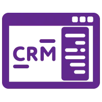
CRM Integration
Digital Division integrated the HubSpot CRM into the WordPress site to track conversions, provide chatbot functionality to website users, and monitor traffic from social and paid search media campaigns.

PPC and Social Campaigns
Pay-Per-Click (PPC) and social campaigns were implemented using SEO-rich keywords to highlight services, specials, and weekly promotions. Digital Division also generated content with new blogs that demonstrated industry knowledge and thought leadership. Email marketing campaigns were used to spread brand awareness and drive traffic to the parent website and the New Health Addiction Clinic website.
Results
Along with increased efficiencies for communicating and tracking leads through the Hubspot CRM, the client demonstrated increased leads and impressive metrics from the marketing assistance of Digital Division.
Due to the SEO and content overhaul, Digital Division helped the client get a 64% increase in search impressions among the search terms that the client was most wanting to be found for. In addition, the paid and social campaigns resulted in a 51% increase in traffic and lead form fills were up 171% quarter over quarter.
Spotlight is on You Next!
Behavior metrics like the ones New Health Kansas experienced are like another day at the Spa for Digital Division. Come join the list of clients whose brands are being pampered and showered with success!