string(14732) "/**
* Correct `block` display not defined in IE 8/9.
*/
article,
aside,
details,
figcaption,
figure,
footer,
header,
hgroup,
main,
nav,
section,
summary {
display: block;
}
/**
* Correct `inline-block` display not defined in IE 8/9.
*/
audio,
canvas,
video {
display: inline-block;
}
/**
* Prevent modern browsers from displaying `audio` without controls.
* Remove excess height in iOS 5 devices.
*/
audio:not([controls]) {
display: none;
height: 0;
}
/* ==========================================================================
Base
========================================================================== */
/**
* 1. Set default font family to sans-serif.
* 2. Prevent iOS text size adjust after orientation change, without disabling
* user zoom.
*/
html {
font-family: sans-serif; /* 1 */
-ms-text-size-adjust: 100%; /* 2 */
-webkit-text-size-adjust: 100%; /* 2 */
}
/**
* Remove default margin.
*/
body {
margin: 0;
}
/* ==========================================================================
Links
========================================================================== */
/**
* Remove the gray background color from active links in IE 10.
*/
a {
background: transparent;
}
/**
* Address `outline` inconsistency between Chrome and other browsers.
*/
a:focus {
outline: thin dotted;
}
/**
* Improve readability when focused and also mouse hovered in all browsers.
*/
a:active,
a:hover {
outline: 0;
}
/* ==========================================================================
Typography
========================================================================== */
/**
* Address differences between Firefox and other browsers.
*/
hr {
-moz-box-sizing: content-box;
box-sizing: content-box;
height: 0;
}
/**
* Prevent `sub` and `sup` affecting `line-height` in all browsers.
*/
sub,
sup {
font-size: 75%;
line-height: 0;
position: relative;
vertical-align: baseline;
}
sup {
top: -0.5em;
}
sub {
bottom: -0.25em;
}
/* ==========================================================================
Forms
========================================================================== */
/**
* 1. Correct font family not being inherited in all browsers.
* 2. Correct font size not being inherited in all browsers.
* 3. Address margins set differently in Firefox 4+, Safari 5, and Chrome.
*/
button,
input,
select,
textarea {
font-family: inherit; /* 1 */
font-size: 100%; /* 2 */
margin: 0; /* 3 */
}
/**
* Address Firefox 4+ setting `line-height` on `input` using `!important` in
* the UA stylesheet.
*/
button,
input {
line-height: normal;
}
/**
* Address inconsistent `text-transform` inheritance for `button` and `select`.
* All other form control elements do not inherit `text-transform` values.
* Correct `button` style inheritance in Chrome, Safari 5+, and IE 8+.
* Correct `select` style inheritance in Firefox 4+ and Opera.
*/
button,
select {
text-transform: none;
}
/**
* 1. Avoid the WebKit bug in Android 4.0.* where (2) destroys native `audio`
* and `video` controls.
* 2. Correct inability to style clickable `input` types in iOS.
* 3. Improve usability and consistency of cursor style between image-type
* `input` and others.
*/
button,
html input[type="button"], /* 1 */
input[type="reset"],
input[type="submit"] {
-webkit-appearance: button; /* 2 */
cursor: pointer; /* 3 */
}
/**
* Re-set default cursor for disabled elements.
*/
button[disabled],
html input[disabled] {
cursor: default;
}
/**
* Remove inner padding and border in Firefox 4+.
*/
button::-moz-focus-inner,
input::-moz-focus-inner {
border: 0;
padding: 0;
}
/**
* 1. Remove default vertical scrollbar in IE 8/9.
* 2. Improve readability and alignment in all browsers.
*/
textarea {
overflow: auto; /* 1 */
vertical-align: top; /* 2 */
}
/* ==========================================================================
Tables
========================================================================== */
/**
* Remove most spacing between table cells.
*/
table {
border-collapse: collapse;
border-spacing: 0;
}
*, *:after, *:before {
-webkit-box-sizing: border-box;
-moz-box-sizing: border-box;
box-sizing: border-box;
}
.blitz-has-parallax {
position: relative;
overflow: hidden;
}
.blitz-parallax {
position: absolute;
left: 0;
top: 0;
bottom: 0;
right: 0;
background-size: 100%;
transform: translateZ(-1px) scale(1.5);
z-index: -1;
background-attachment: fixed;
}
.post-list .default .thumbnail {
padding-right: 15px;
}
.post-list .default .preview {
display: inline-block;
vertical-align: top;
}
.post-list article.default {
padding-bottom: 20px;
border-bottom: 1px solid #8080803d;
margin-bottom: 20px;
display: inline-block;
}
#content p,
#content h1,
#content h2,
#content h3,
#content h4,
#content h5,
#content h6 {
margin-top: 0;
}
button {
font-size: 100%;
line-height: normal;
}
header nav li .sub-menu {
position: absolute;
background: white;
box-shadow: 1px 2px 3px rgba(0, 0, 0, 0.6);
border-top: 2px solid rgb(68, 68, 68);
display: none;
padding: 0;
min-width: 200px;
z-index: 9;
}
header .menu-item-has-children > a:after {
content: '\f0d7';
position: absolute;
font-family: 'Font Awesome 5 Free';
margin-left: 5px;
margin-top: 4px;
font-size: 13px;
font-weight: 600;
}
header nav li:hover > .sub-menu {
display: block;
}
header nav li {
position: relative;
list-style-type: none;
display: inline-block;
}
header nav li a,
header nav li span.no-link {
width: 100%;
padding: 15px 20px;
display: inline-block;
transition: all .2s ease-in-out;
}
a {
color: #444;
text-decoration: none;
}
.wrapper {
margin: 25px auto;
width: 100%;
}
.wrapper > * {
white-space: initial;
}
/*Module Formatting Styles*/
body:not(.amp) .iframe:not(.ratio-none) {
position: relative;
overflow: hidden;
}
body:not(.amp) .iframe.ratio-16-9 {
padding-top: 56.25%;
}
body:not(.amp) .iframe.ratio-4-3 {
padding-top: 75%;
}
body:not(.amp) .iframe:not(.ratio-none) iframe {
position: absolute;
top: 0;
left: 0;
width: 100%;
height: 100%;
border: 0;
}
.accordion-tab header {
background-color: #eee;
border: none;
padding: 18px;
outline: none;
transition: 0.4s;
font-size: 1.2em;
}
.accordion.no-styling header, .accordion.read-more header {
background-color: initial;
padding: 0;
font-size: inherit;
}
.accordion header {
cursor: pointer;
}
.accordion [expanded] > header,
.accordion header:hover {
background-color: #ccc;
}
.accordion.no-styling [expanded] > header, .accordion.read-more [expanded] > header,
.accordion.no-styling header:hover, .accordion.read-more header:hover {
background-color: initial;
}
.accordion .panel {
display: none;
overflow: hidden;
}
.accordion.read-more header {
font-weight: bold;
}
.accordion.read-more .panel,
.accordion.no-styling .panel {
padding-top: 1em;
}
.accordion-tab .panel {
padding: 16px 18px 0;
background-color: white;
}
.accordion.read-more .panel,
.accordion.no-styling .panel {
padding-top: 1em;
}
.accordion.no-styling .panel {
background-color: initial;
}
.accordion.read-more .panel {
background-color: #eee;
margin-top: 1em;
}
.accordion [expanded] > .panel {
display: block;
}
.icon.wrapper .icon-wrap {
display: inline-block;
width: 1em;
height: 1em;
border-style: solid;
box-sizing: border-box;
position: relative;
}
.icon.wrapper .icon-wrap .icon-inner {
position: absolute;
left: 50%;
top: 50%;
transform: translate(-50%, -50%);
font-size: 75%;
}
.icon.wrapper .icon-innards {
position: relative;
display: inline-block;
}
.icon.wrapper .icon-innards > a {
position: absolute;
left: 0;
top: 0;
width: 100%;
height: 100%;
z-index: 1;
}
.icon.wrapper .caption {
text-align: left;
}
.icon.wrapper .caption a,
.icon.wrapper a.button {
position: relative;
z-index: 2;
}
.icon.wrapper.place-Top .caption {
margin-top: 1em;
}
.icon.wrapper.place-Left .icon-innards,
.icon.wrapper.place-Right .icon-innards {
display: inline-flex;
}
.icon.wrapper.place-Left .icon-bottom {
padding-left: 1.5em;
}
.icon.wrapper.place-Right .icon-bottom {
padding-right: 1.5em;
}
.icon.wrapper.vert-Middle .icon-innards {
align-items: center;
}
.icon.wrapper.vert-Bottom .icon-innards {
align-items: flex-end;
}
.icon.wrapper .button.wrapper {
margin-bottom: 0;
}
.icon.wrapper .caption > *:last-child {
margin-bottom: 0;
}
.icon.wrapper .custom-icon div {
width: 1em;
height: 1em;
background-position: center;
background-size: contain;
background-repeat: no-repeat;
position: absolute;
left: 50%;
top: 50%;
transform: translate(-50%, -50%);
}
.icon.wrapper .custom-icon div:nth-of-type(2) {
opacity: 0;
}
.blitz-mobile-menu [expanded] > header,
.blitz-mobile-menu header:hover {
background-color: #eee;
}
.blitz-mobile-menu .sub-menu > header {
background: #ccc;
}
.blitz-mobile-menu .toggle {
float: right;
}
.orient-center {
text-align: center;
}
.orient-left {
text-align: left;
}
.orient-right {
text-align: right;
}
.orient-justified {
text-align: justify;
}
.text-light {
color: #ffffff;
}
.menu-toggle button {
background: transparent;
border: none;
}
.section.background-img {
background-size: cover;
}
.section-overlay {
position: absolute;
left: 0;
top: 0;
width: 100%;
height: 100%;
z-index: 2;
}
.section.has-overlay {
position: relative;
}
.section.has-overlay > *:not(.section-overlay):not(.blitz-parallax),
.section.has-overlay:before,
.section.has-overlay:after {
z-index: 3;
position: relative;
}
/*End Module Formatting Styles*/
/*Template Constraints*/
.section {
width: 100%;
padding: 25px 0;
text-align: center;
white-space: nowrap;
}
header .section {
padding: 0;
}
header .constraint {
align-items: center;
}
.constraint {
width: 80%;
display: flex;
margin: 0 auto;
flex-wrap: wrap;
justify-content: flex-start;
}
.section.fullwidth .constraint {
width: 100%;
max-width: initial;
}
.column {
box-sizing: border-box;
padding: 0 10px;
display: inline-block;
vertical-align: top;
white-space: normal;
text-align:left;
}
.width-12 {
width: 100%;
display: block;
}
.width-9 {
width: 75%;
}
.width-8 {
width: 66.66%;
}
.width-6 {
width: 50%;
}
.width-4 {
width: 33.33%;
}
.width-3 {
width: 25%;
}
/*End Template Constraints*/
/* Admin Bar AMP */
.admin-bar-amp {
background: #23282d;
padding-left: 15px;
padding-right: 15px;
color: #eee;
line-height: 0;
}
.admin-bar-amp p {
margin: 0;
font-size: 13px;
}
.admin-bar-amp .useful-links {
line-height: 0;
}
.admin-bar-amp .user-info a {
margin-left: 10px;
}
.admin-bar-amp .user-info {
text-align: right;
}
.admin-bar-amp a i {
margin-right: 6px;
}
.admin-bar-amp a {
color: #eee;
display: inline-block;
line-height: 32px;
padding: 0 8px 0 7px;
font-size: 13px;
}
.admin-bar-amp a:hover {
background-color: #32373c;
color: #00b9eb;
}
.admin-bar-amp > div {
width: 50%;
display: inline-block;
vertical-align: middle;
}
/* End Admin Bar AMP */
img {
max-width: 100%;
height: auto;
}
.uses-fixed-header.admin-bar > header {
margin-top: 32px;
}
.halign-left {
justify-content: left;
}
.halign-mid,
.halign-center,
.halign-middle {
justify-content: center;
}
.halign-right {
justify-content: right;
}
.halign-self-left {
justify-self: left;
}
.halign-self-mid,
.halign-self-center,
.halign-self-middle {
justify-self: center;
}
.halign-self-right {
justify-self: right;
}
.valign-top {
align-items: flex-start;
}
.valign-mid,
.valign-middle {
align-items: center;
}
.valign-bottom {
align-items: flex-end;
}
.valign-self-top {
align-self: flex-start;
}
.valign-self-mid,
.valign-self-middle {
align-self: center;
}
.valign-self-bottom {
align-self: flex-end;
}
/*Media Queries*/
@media all and ( min-width: 1025px ) {
.admin-bar.uses-fixed-header .content-wrapper,
.ui-page.uses-fixed-header > header {
margin-top: 32px;
}
.blitz-mobileT {
display: none;
}
}
@media all and ( min-width: 768px ) {
.blitz-mobile {
display: none;
}
}
@media all and (max-width: 1024px) {
.section {
padding: 12.5px 0;
}
.wrapper {
margin: 12.5px 0;
}
.blitz-desktop {
display: none;
}
}
@media all and ( max-width: 767px ) {
.column:not(.no-resize):not(.blitz-desktop):not(.blitz-desktopT),
.width-12:not(.no-resize):not(.blitz-desktop):not(.blitz-desktopT),
.width-9:not(.no-resize):not(.blitz-desktop):not(.blitz-desktopT),
.width-8:not(.no-resize):not(.blitz-desktop):not(.blitz-desktopT),
.width-6:not(.no-resize):not(.blitz-desktop):not(.blitz-desktopT),
.width-4:not(.no-resize):not(.blitz-desktop):not(.blitz-desktopT),
.width-3:not(.no-resize):not(.blitz-desktop):not(.blitz-desktopT) {
width: 100%;
display: block;
}
.blitz-desktopT {
display: none;
}
.constraint {
width: 90%;
}
}
.constraint {
max-width: 1516px;
}
@media all and (min-width: 1025px) {
body > header, .ui-page > header {
position: fixed;
top: 0;
width: 100%;
z-index: 9;
}
}
#mobile-header .header-cta {
text-align: center;
}
#mobile-header .header-cta a {
color: #474747;
margin-left: 5px;
}
.header-cta {
margin: 0;
}
@media all and (max-width:480px){
.header-cta span{
display:none;
}
.header-cta a:before{
content:;
}
} .wrapper[data-index="21"] { margin-top: 0; } .wrapper[data-index="21"] { margin-bottom: 0; } .column[data-index="0"] { padding-left: 5px; } .column[data-index="0"] { padding-right: 5px; }
.menu-toggle button {
padding: 0;
outline: none;
}
.mobile-menu header.no-toggle {
padding: 0;
}
.mobile-menu.accordion .panel {
padding: 0;
}
.mobile-menu .menu {
position: absolute;
width: 100%;
z-index: 9;
left: 0;
}
.mobile-menu header {
width: auto;
}
.mobile-menu .accordion {
position: relative;
}
.section[data-index="13"] { padding-top: 0; } .section[data-index="13"] { padding-bottom: 0; } .wrapper[data-index="48"] { margin-top: 0; } .wrapper[data-index="48"] { margin-bottom: 0; } .column[data-index="24"] { padding-left: 0; } .column[data-index="24"] { padding-right: 0; } .section[data-index="14"] { padding-bottom: 0px; } .column[data-index="28"] { padding-left: 0; } .column[data-index="28"] { padding-right: 0; }"
A Recipe for Client Engagement
Shick Esteve
Shick Esteve is a leading provider in complete, integrated ingredient automation systems for the food manufacturing supply and ingredient automation industry. Providing operating systems worldwide, Shick Esteve is a member of many prestigious food industry affilitates. When they needed a WOW factor at the IBIE conference in September 2019, Shick Esteve called Digital Division to design and implement a unique, creative and engaging solution on an interactive touch screen kiosk platform.
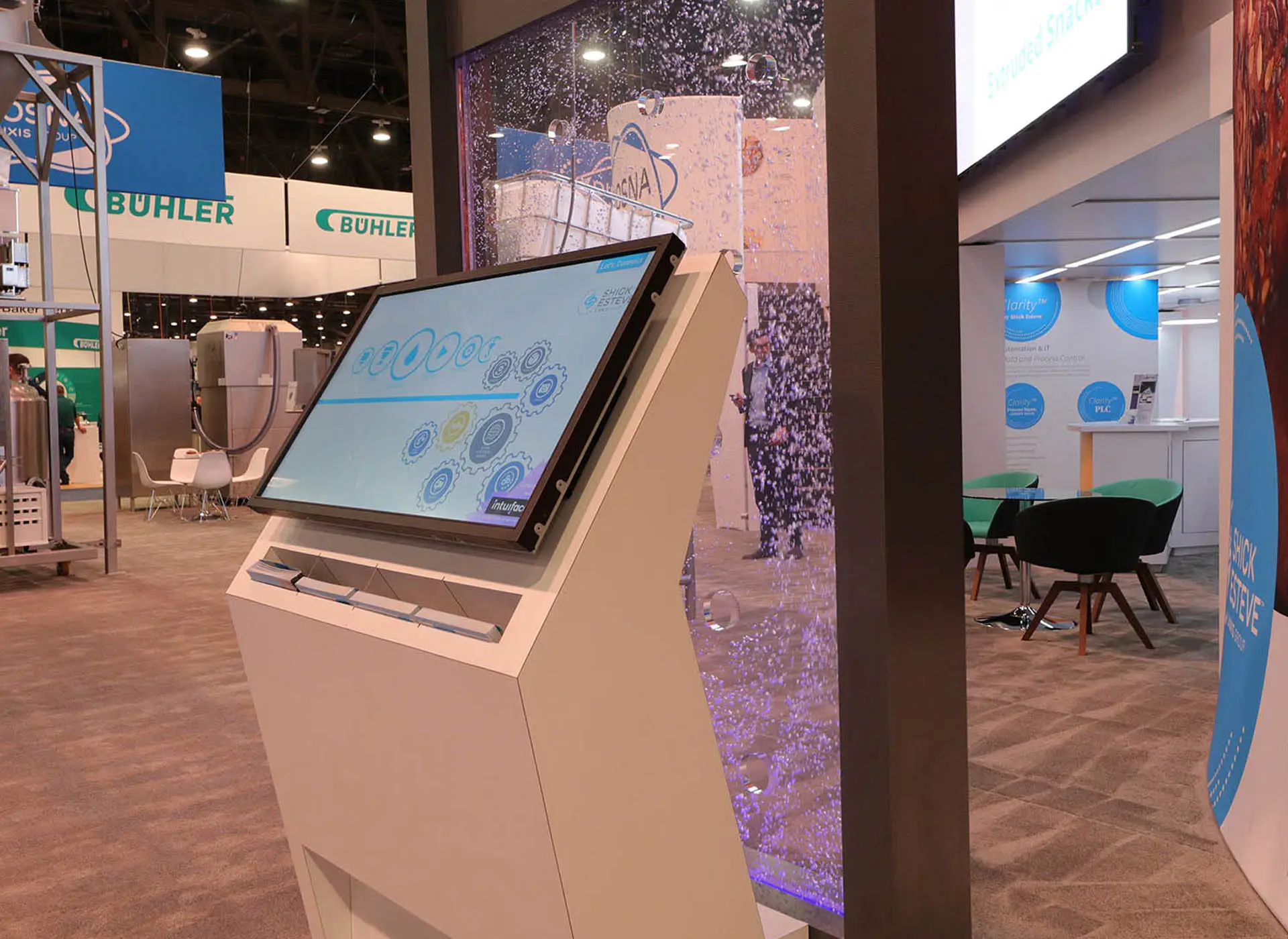
Not only was this kiosk an ingredient for hooking tradeshow participants but it was the first-step in an ongoing sales tool that allowed for users to see commercial ingredient automation equipment videos, specifications and Shick Esteve's quality assurance processes. With a simple swipe and a drag, kiosk users are able to collect digital brochures, videos, PDF documentation and more - throughout the customer journey and email any information to themselves - all right from the convenience of the kiosk!
A Stirring Success
Digital Division utilized Shick Esteve's kiosk platform and devised customer journeys with a critical UX design to ensure users paths were intuitive. The design was developed to complement existing brand standards and enhance functionality and user engagement. Digital Division provided content flow strategy, included animations to promote additional engagement and user interest, ensured the branding was consistently implemented in all assets, and was consulted on the vision to create user interfaces. The implementation was brought to life by a tightly woven effort between Digital Division’s creative strategists, strategic architects and in-house developers.
"We had the most forward-thinking booth that garnered the greatest attention and engagement. The touch screen was phenomenal!"
- Shick Esteve Mixing it Up with Crowd-Pleasing Animations
Using the marketing software Intuiface, Digital Division developed an animated kiosk program with end-to-end experiences for different customer paths (sales, engineering, management). Users at the tradeshow were able to engage with the kiosk with the support of an on-hand salesperson or navigate the kiosk independently. Each screen was developed to showcase company information in a multi-faceted user experience. Digital Division also developed animations to enhance and create an overall more engaging user experience.
Results
In a compressed timeline, Digital Division used a pioneering programming software to develop an interactive user interface for Shick Esteve’s conference display. The kiosk dazzled tradeshow participants and allowed the Shick Esteve to bring the user experience to life as it was presented on a bubble wall in Las Vegas.
Let's Cook Up Something Exciting
Digital Division is always looking for creative opportunities to push the envelope and help our clients standout from the competition. Join organizations like Shick Esteve and connect with Digital Division on an engaging and progressive marketing solution today!
206 SE 2nd St
Lee's Summit, Missouri 64063